

Design
Comcast NBCUniversal / Symphony priority-level logos + style guide
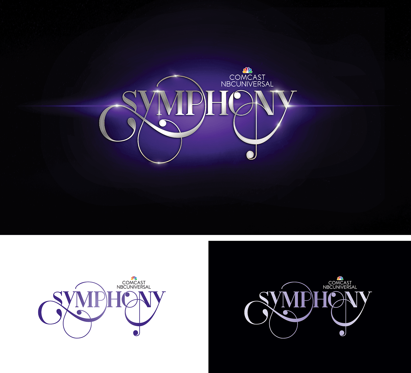
Symphony is Comcast NBCUniversal’s marketing initiative in which various divisions of the media conglomerate work together to promote a single project, including TV show launches, special events, theme park attractions and movies. They needed a simpler, vector logo based on their existing 3D graphic that functioned better in all formats and maintained the purple gradient.
above: original 3d graphic / positive vector / negative vector
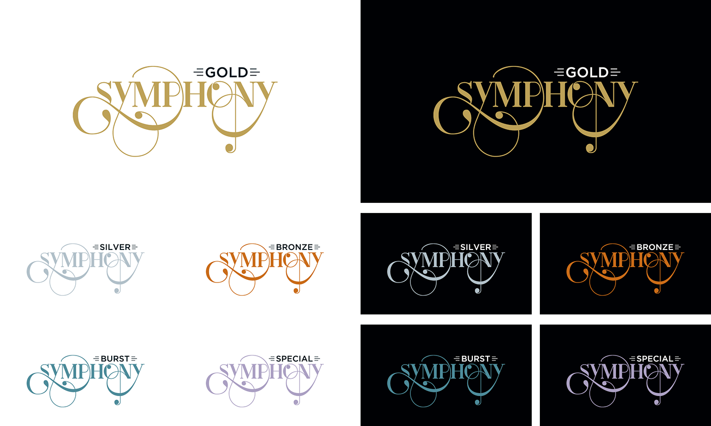
There are different levels of support depending on the scope of a project. They already spoke of projects this way internally and assigned colors to the top three. Priority-level logos and additional color-coding helped to quickly define each project’s heirarchy.
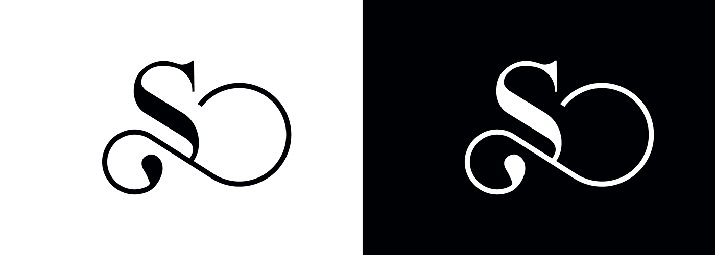
After Symphony was established, the client wanted a less elaborate mark that referred back to the original.


